
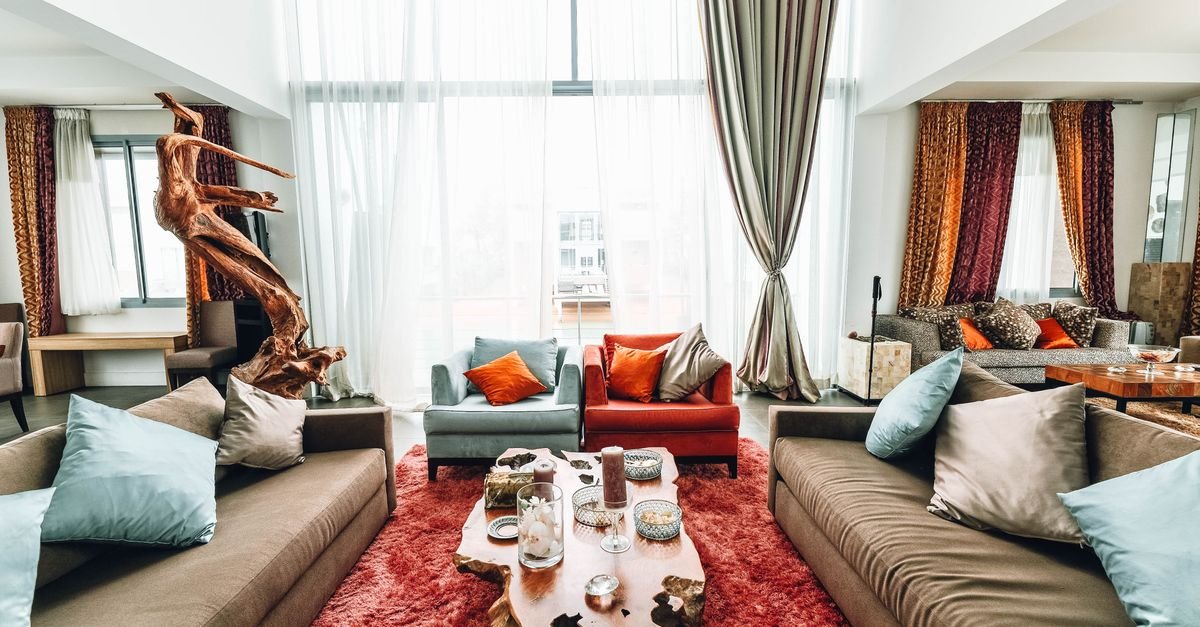
Somewhere along the way, decorating folklore issued a terrifying rule: all your wood must match. And so millions of rooms froze — the walnut coffee table forever apologizing to the oak floor, the vintage teak dresser exiled for clashing with the bed frame.
Also Read



Here’s the liberating truth from the design world: matched wood is what looks dated. Mixed wood — done with three simple rules — is what looks collected, layered, and expensive.
Quick answer: To mix wood tones like a designer: pick one dominant wood (usually your floor or largest piece) as the anchor, keep the undertones consistent (warm with warm, cool with cool), repeat each wood tone at least twice so it reads as intentional, aim for contrast rather than near-match (close-but-not-equal is what looks accidental), and use buffers — rugs, textiles, paint, metals — to give different woods breathing room. Two to four wood tones per room is the sweet spot.
Key Takeaways
- Matching all wood is the mistake — matched sets read flat and dated; mixed tones read collected and designed.
- Choose a dominant tone (floor or biggest piece) and let every other wood relate to it.
- Undertone is the real rule: warm woods with warm, cool with cool — mixing undertones is what “clashes.”
- Repeat every tone at least twice across the room — repetition converts accident into intention.
- Go clearly different or go home: high contrast mixes beautifully; near-misses look like failed matching.
- Rugs are the peacekeepers — a rug between wood furniture and wood floor lets any two tones coexist.
Why Does Matched Wood Look Dated?
Because rooms that evolve naturally never match. The homes that inspire “collected over time” envy accumulated their pieces across years — the inherited dresser, the market find, the new sofa — and the mix itself is what signals life, taste, and history.
A perfectly matched suite, by contrast, says “one store, one afternoon, one credit card receipt.” The eye reads sameness as flatness: nothing advances, nothing recedes, no piece gets to be interesting.
Designers exploit the opposite: contrast creates depth. A dark walnut table pops against a pale oak floor; identical oak-on-oak dissolves into a beige soup.
So permission granted, officially: stop trying to match. Start orchestrating.
What Is the Dominant Wood Rule?
Every well-mixed room has a hierarchy, and it starts with one decision: which wood is in charge?
Usually it’s the largest wood surface — the floor, most often, or in carpeted rooms the biggest furniture piece. That’s your dominant tone, the reference point every other wood gets judged against.
The practical payoff: instead of the impossible question “do these five woods work together?”, you only ever ask “does this piece work with the anchor?” — a question you can answer in a furniture store with a photo of your floor on your phone.
Supporting woods then play secondary roles at smaller scales: a contrasting coffee table, picture frames, bowls, a mirror frame — each relating back to the anchor, none competing for the crown.
What Are Undertones, and Why Are They the Real Rule?
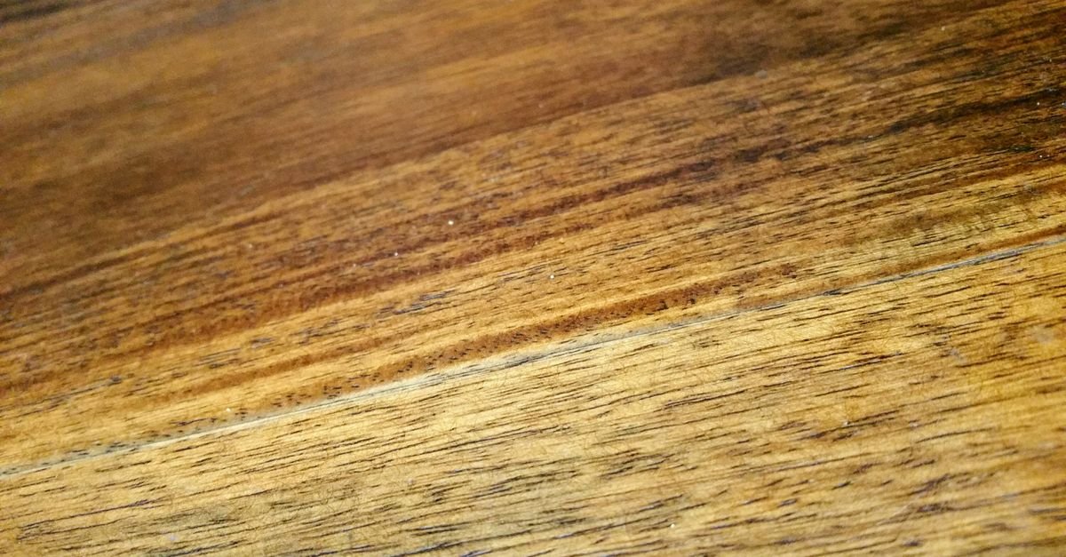
Here’s the secret that explains every “why does this feel off?” moment: two woods clash not because one is darker, but because their undertones disagree.
Every wood leans one of three ways beneath its surface color:
Warm — yellow, orange, or red underneath: oak (golden), cherry, teak, mahogany, most walnuts.
Cool — gray or ashy underneath: driftwood finishes, gray-washed oak, ebonized pieces.
Neutral — beige-quiet, neither obviously golden nor gray: white oak, some ash and maple finishes. Neutrals are diplomats — they sit happily beside either camp.
The rule: stay in one undertone family per room (plus neutrals at will). A honey oak floor + walnut table + cherry frames = harmonious, despite three very different colors. That same floor + one gray-washed console = the subtle wrongness nobody can name.
Squint test for undertone: photograph the wood next to something white — the lean toward gold or gray reveals itself instantly.
How Many Wood Tones Can One Room Hold?
The designer consensus: two to four, with three as the classic sweet spot.
Two tones (anchor + one contrast) is safe and clean — ideal for minimalists. Three adds richness with easy control. Four rewards confidence and needs the repetition rule working hard. Beyond four, rooms drift toward the lumberyard.
And the pairing math from the contrast principle: make each tone clearly different from the next — light, medium, dark reads as designed; three slightly-different mediums reads as a matching attempt that missed. When two of your woods are frustratingly close-but-not-equal, separate them across the room or let a buffer sit between them.
What Is the Repeat-It-Twice Rule?
The single trick that turns “random” into “intentional”: every wood tone in the room should appear at least twice.
One walnut chair in an oak room looks like a stray. Add a walnut picture frame across the room and a walnut bowl on the shelf — suddenly the chair has echoes, and the eye reads a deliberate walnut thread woven through the space.
The repeats can be tiny: frames, candlesticks, trays, bowls, lamp bases, a floating shelf (the shelf-styling trio is a perfect echo-delivery system). Small objects are cheap tone-repeaters — this is exactly what thrift-store wooden bowls were born for.
Triangulate when possible: three appearances at three points pulls the eye around the room in the same zigzag magic that makes gallery walls work.
How Do Buffers Make Any Mix Work?
Even correct mixes need breathing room — wood directly on wood is where trouble concentrates. The peacekeepers:
Rugs, first and forever. A rug between wooden furniture legs and a wooden floor resets the space entirely — with a rug present, the floor and table barely need to negotiate at all. (Size it right or the magic fails: the rug size guide has the numbers.)
Textiles everywhere else: table runners under wooden bowls, cushions on wooden benches, a throw over the chair arm — fabric softens every wood-to-wood handshake.
Paint and walls are giant buffers — wood tones that would argue side-by-side coexist peacefully across a painted room.
Metals, glass, stone, ceramics: a brass lamp or marble tray between two woods gives the eye a palate cleanser. Mixed materials make mixed woods look more deliberate, not less.
Black — the secret weapon: a few black accents (frames, hardware, a chair) ground any wood mix and make every tone look sharper. Designers reach for this constantly.
How Do You Mix Wood Tones Room by Room?
Living room
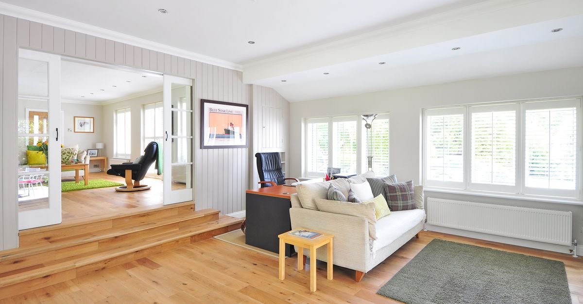
Floor = anchor. Coffee table in a clear contrast (dark on light floors, light on dark), media console either matching the table (a repeat!) or neutral, then echo woods in frames and objects. Rug under the seating zone as chief peacekeeper.
Dining room
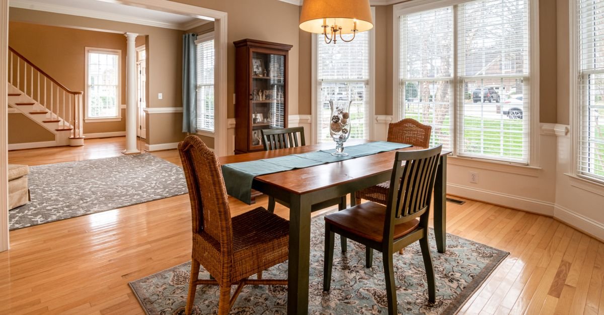
The classic power move: table and chairs in different tones — dark table, lighter chairs (or the reverse), floor as the third voice with a rug beneath if floor and table fight. Matching dining sets are the fastest room in the house to date itself.
Bedroom
Bed frame anchors; nightstands may contrast (they don’t need to match each other either — heresy that works); dresser repeats one existing tone. Bedding provides acres of buffer (the layering formula does double duty here).
Kitchen
Cabinets dominate by area — wood floors want clear contrast with them (or a neutral diplomat), open shelving repeats one tone, and butcher block or wooden stools add echoes. Cutting boards leaned against the backsplash: free tone-repeaters.
Small spaces
Fewer tones, higher contrast, more repetition — two woods handled crisply beat four woods crowding each other (the whole philosophy of our small-room playbook).
What Are the Most Common Wood-Mixing Mistakes?
The near-match. Two woods almost identical but not quite — the eye reads failure-to-match rather than choice. Fix: separate them, buffer them, or lean into more contrast elsewhere.
Undertone mixing. The gray-washed piece in the golden room (or vice versa) — the clash people feel but can’t articulate. Audit undertones before buying.
The lonely wood. A single unrepeated tone floating with no echoes — add two small repeats or rehome the piece.
Matching everything to the floor. Floor-toned furniture dissolves into it — legs vanish, the room flattens. The floor wants contrast standing on it.
Forgetting fixed wood: door frames, window trim, exposed beams, and stair rails are all voices in the choir — count them when choosing your family.
Wood-on-wood-on-wood with no relief: no rug, no textiles, no metals — even correct tones exhaust the eye without buffers. Every wood room needs non-wood oxygen.
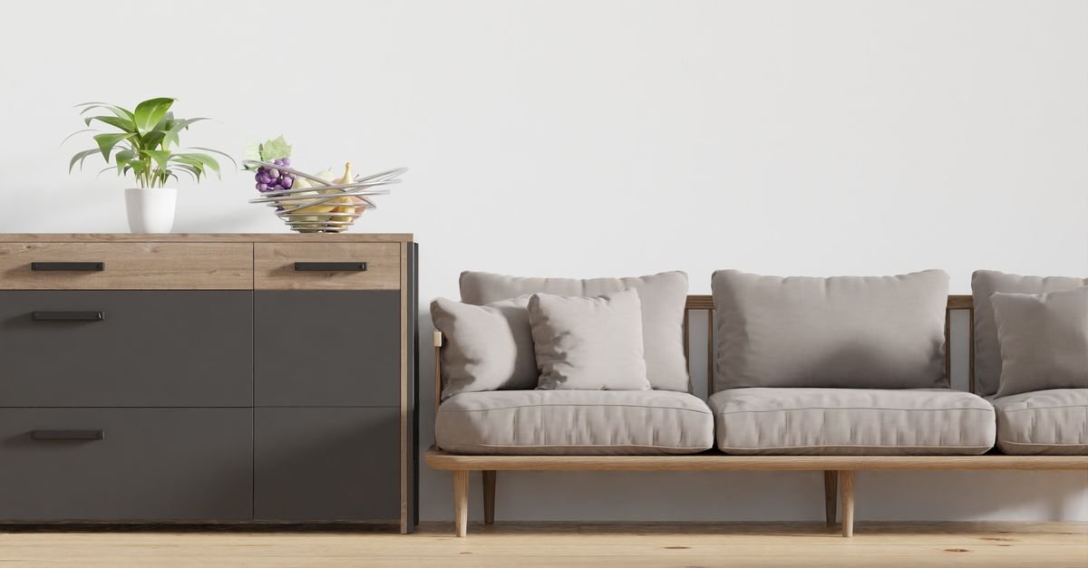
Can You Fix a Room Where the Woods Already Clash?
Almost always — and usually without replacing furniture:
Add the missing repeats. The quickest rescue: give every lonely tone two small echoes (frames, bowls, a tray). Ten dollars of thrifted objects can legitimize a whole room.
Deploy a bigger rug. Half of “my table clashes with my floor” cases are actually “my rug is too small” cases in disguise.
Buffer the worst neighbor. The two pieces that argue most — separate them physically or slide fabric/metal/greenery between them.
Convert one voice. A single odd-undertone piece can be sanded and refinished, painted (painted furniture exits the wood choir entirely), or draped — one conversion often resolves the whole argument.
Add black and greenery. Black accents sharpen; plants forgive. Between them, most “clashing” rooms just… stop clashing.
The wood-mixer’s toolkit — solid Amazon searches:
How Do Painted and White Furniture Fit In?
The question every mixed-wood room eventually asks: where do the white bookcase and the black-painted chair fit?
Happily: painted furniture exits the wood conversation entirely. A painted piece reads as its paint color, not as a wood tone — which makes white, black, and colored furniture the ultimate diplomats in a wood mix.
Use them exactly like buffers: a white dresser between two arguing wood tones resets the eye; black accents sharpen every wood they sit near; a painted island lets kitchen cabinets and floors stop negotiating.
Two guardrails: keep some real wood visible (an all-painted room loses the warmth this whole project is about), and repeat painted colors twice, same as woods — the intention rule doesn’t care what the surface is made of.
Frequently Asked Questions
Is it OK to mix wood tones in a room?
Not just OK — it’s what designers do on purpose. Matched wood sets read flat and dated; mixed tones read collected and layered. The craft is in the rules: one dominant tone, consistent undertones, every tone repeated twice, and buffers like rugs and textiles between woods.
How many different wood tones can you have in one room?
Two to four, with three as the sweet spot. Keep each tone clearly distinct from the next (light/medium/dark beats three near-identical mediums) and repeat each at least twice so the mix reads as intentional.
Do wood floors and furniture have to match?
No — they generally shouldn’t. Furniture matching the floor visually dissolves into it. Aim for clear contrast between floor and major pieces, keep undertones in the same warm-or-cool family, and let a properly sized rug buffer the conversation.
What are wood undertones and how do I identify them?
The color leaning underneath the surface: warm woods lean yellow-orange-red (oak, cherry, teak, walnut), cool woods lean gray (driftwood and gray-washed finishes), neutrals sit quietly between (white oak, some maples). Photograph the wood next to something white — the gold-or-gray lean shows immediately.
Can I mix dark and light wood furniture?
Yes — high contrast is the easiest mix, far safer than close-but-not-matching tones. Dark table on light floor, light chairs at a dark table: as long as undertones agree and each tone repeats somewhere, contrast looks deliberate and expensive.
How do I make mismatched wood furniture look intentional?
Repetition and buffers: give every wood tone at least two appearances in the room (small objects count), put a rug between furniture and floor, add textiles and a few black or metal accents, and separate the two most argumentative pieces. Intentional is a pattern, and patterns can be added after the fact.
Should nightstands match the bed?
They don’t need to — contrasting nightstands (even two different ones) are a designer staple, provided undertones stay in family and the tones echo elsewhere in the room. The layered-bedding buffer between them makes almost any combination work.
The bottom line
Wood mixing has exactly four moving parts: crown an anchor, keep undertones in family, repeat every voice twice, and buffer the handshakes with rugs and textiles. Master those and the “matching” anxiety dissolves — replaced by rooms that look like they grew, piece by interesting piece, around a person with taste. Which, now, they did.

I'm Nasir Uddin Khan, founder of HomeNeeds24 and a senior IT consultant with 18+ years' experience in Oracle database administration, enterprise infrastructure and ERP system design. I write the buying guides here and I build every calculator on the site myself, from published engineering standards rather than opinion. My research is structured rather than lab-based: manufacturer specifications, safety and efficiency standards, and the trade-offs that repeat across large volumes of verified customer reviews. Where I have direct hands-on experience — smart home, networking, energy and anything computer-adjacent — I say so in the guide.