
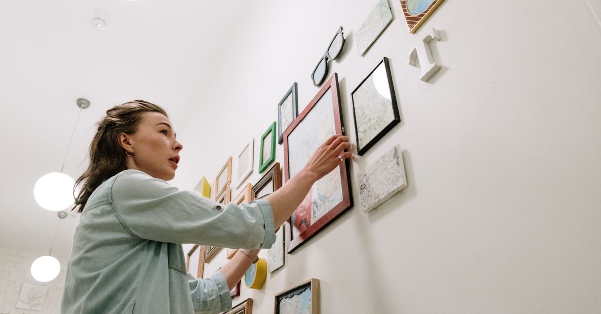
Somewhere in your home there’s a blank wall that’s been silently judging you for months. You’ve saved thirty gallery-wall photos for it. You own art. You even own a hammer.
Also Read


And yet the wall stays blank — because the moment you imagine actually nailing holes in a pattern, the fear of getting it wrong wins again.
Quick answer: To create a gallery wall, collect your pieces first, arrange them on the floor around one large anchor piece, cut paper templates of every frame, tape the templates to the wall to test the layout, keep 2–3 inches between frames with the group’s center at about 57–60 inches from the floor — then hang, working from the anchor outward. Templates are the whole secret: every hole goes exactly where it should.
Key Takeaways
- Plan on the floor, commit on paper, then hang — paper templates eliminate wrong holes entirely.
- Start with one anchor piece (your largest) placed slightly off-center, and build outward.
- Keep spacing consistent: 2–3 inches between frames is the designer sweet spot.
- The group’s visual center belongs at 57–60 inches from the floor — museum eye level.
- Mix sizes and orientations, but repeat one unifying thread: frame color, mat style, or palette.
- Renters can do all of this with adhesive strips — no holes at all.
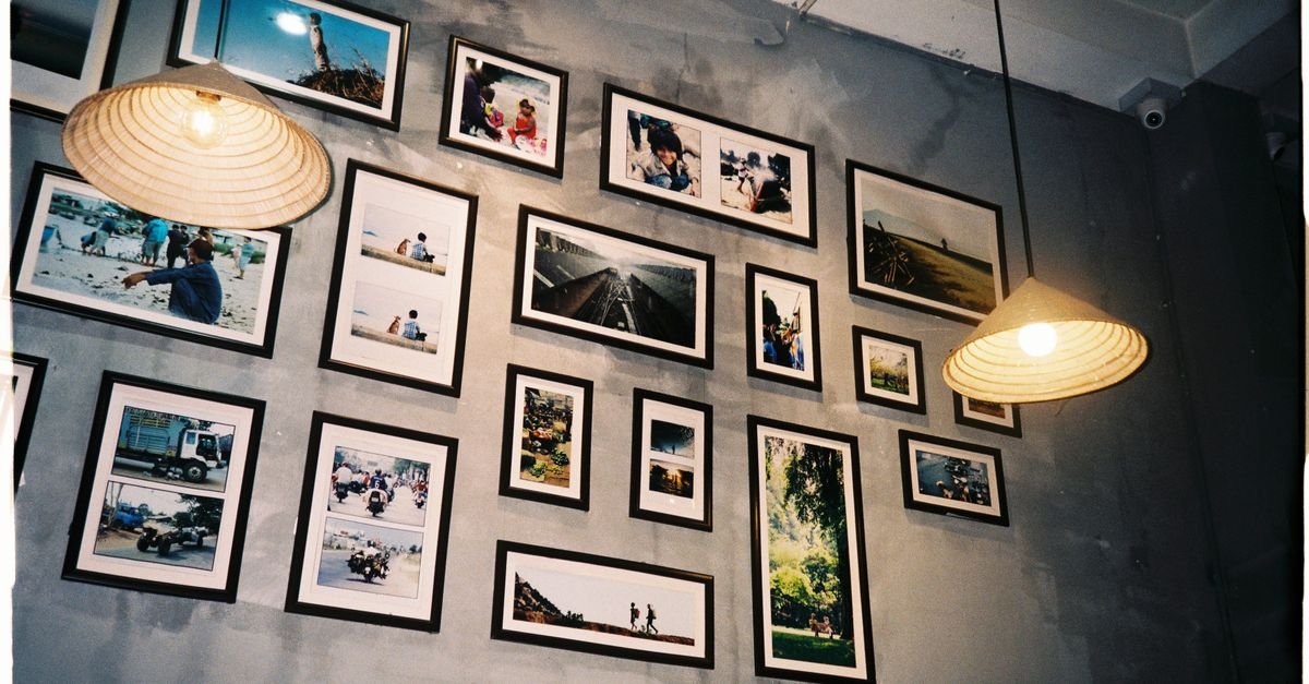
Why Do Gallery Walls Work So Well?
A gallery wall is the highest-impact decor move per dollar in the house. One big statement piece can cost hundreds; a gallery wall builds the same presence from pieces you may already own.
It also solves the awkward-wall problem: staircases, hallways, and the big empty rectangle above the sofa all struggle with single pieces but flourish with a collection.
Most importantly, it’s the most personal wall in the home — travel photos, kids’ art, prints, heirlooms — arranged so the collection reads as one intentional design instead of clutter.
What Should Go on a Gallery Wall?
The best walls mix — and the mix follows a loose recipe:
The backbone (about half): framed prints, photography, or paintings. This is where your botanical prints or family photos live.
The texture (a quarter): something not-flat — a small woven hanging, a ceramic plate, a mirror, a shadow box. These break the “grid of rectangles” monotony.
The personality (the rest): the pieces with stories. A pressed flower from a trip. A page from an old atlas. A child’s masterpiece in a real frame (instant gallery credibility).
The unifying trick: repeat at least one thread through the whole collection — all black frames, or all warm tones, or matching white mats. Variety in the art, consistency in the packaging.
Which Gallery Wall Layout Should You Choose?
Layouts fall into three families — pick by personality and patience.
The grid: clean and calm
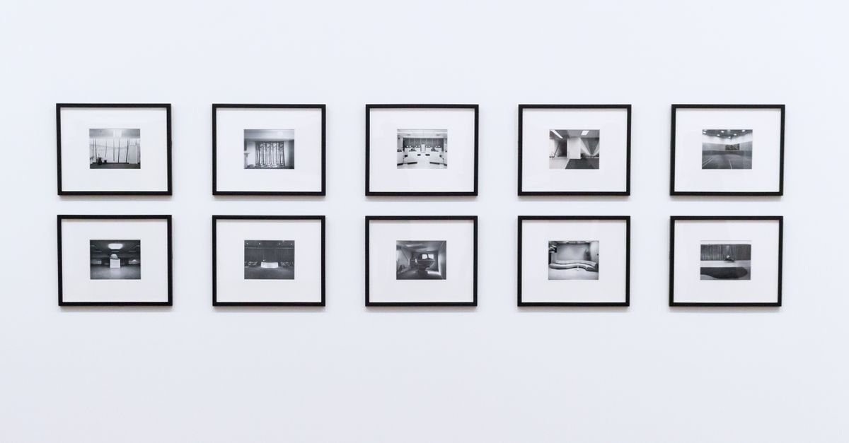
Identical frames, identical spacing, rigid rows. Perfect for a set of matching prints or photos. It reads modern and orderly — and it’s the least forgiving of measurement errors, so templates matter double here.
The salon: collected and cozy
The classic organic cluster — different sizes, orientations, even frame styles, puzzle-fit together. This is the “grew over time” look, and the most forgiving: small imperfections disappear into the abundance.
The linear: one straight spine
Frames of varying sizes aligned along one invisible horizontal line — either all tops aligned, all bottoms, or all centers. Ideal for hallways and above long furniture.
Undecided? Salon-style with a consistent frame color is the safest beautiful choice for a first gallery wall.
What Is the Anchor Piece Rule?
Every good gallery wall starts with one piece pulling rank — the largest or boldest item, called the anchor.
Place the anchor first, slightly off-center in your planned area (dead center makes the wall feel static). Then build outward from it in all directions, alternating sizes as you go.
The anchor gives the eye an entry point, and every other piece gets its position relative to it — which is exactly what makes the cluster feel composed rather than scattered.
No single big piece? Create an anchor zone instead: two medium pieces hung close together act as one visual unit.
How Do You Plan the Layout Without Ruining the Wall?
Here’s the professional method, start to finish. Total cost: a roll of kraft paper and painter’s tape.
Step 1: Floor rehearsal
Mark out your wall’s dimensions on the floor with tape. Arrange the actual pieces inside it — anchor first, then outward — until the balance feels right.
Squint at it. Photograph it. Rearranging on the floor costs nothing.
Step 2: Paper doubles
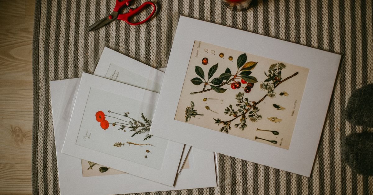
Trace every frame onto kraft paper (or newspaper), cut out the shapes, and label each one. Mark where each frame’s hanger sits on its template — measure from the top edge.
Step 3: Wall audition
Tape the paper doubles to the wall in your floor layout. Live with them for a day. You’ll be shocked what a doorway sightline or a lamp changes.
Shuffle freely — this is the entire point of paper.
Step 4: Hang through the paper
Nail or drill straight through each template’s marked hanger point, then tear the paper away. Every fastener lands exactly right, first try.
How High Should a Gallery Wall Be Hung?
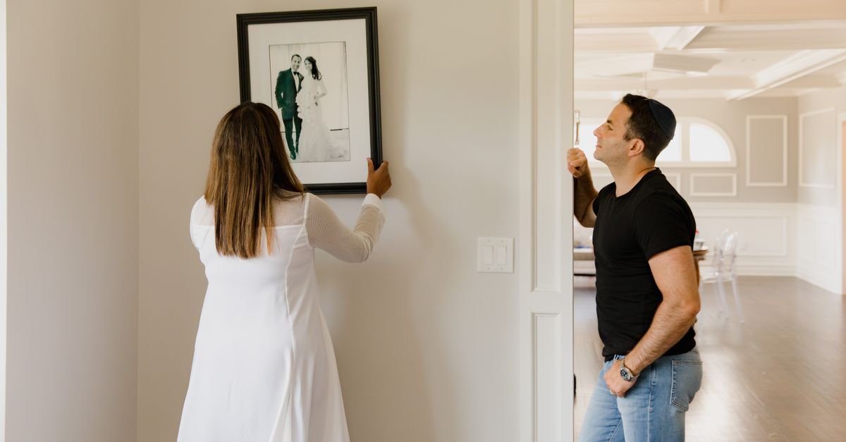
The rule museums use: the center of the composition at 57–60 inches from the floor — average human eye level.
For a gallery wall, treat the entire cluster as one artwork: its collective center hits that height, not each individual frame.
Two exceptions worth knowing:
Above furniture: start the lowest frames 6–10 inches above the sofa back or console top — the furniture and wall should read as one grouped unit.
Staircases: let the invisible center line follow the stair angle, keeping each frame’s center roughly 57–60 inches above the tread below it.
How Much Space Between Frames?
Two to three inches — consistently. This is the number that separates “designer” from “scattered.”
Tighter than 2 inches and frames crowd; wider than 4 and the collection dissolves into separate objects. Whatever gap you choose, repeat it everywhere — consistency of spacing is more important than the exact measurement.
Pro shortcut: cut a cardboard spacer at your chosen gap and use it between every pair of frames while hanging.
What Hardware Should You Use?
Match the fastener to the weight and the wall:
- Light pieces (under ~5 lb): simple picture-hanging nails or adhesive strips.
- Medium (5–20 lb): picture hooks with angled nails — the classic brass hooks hold far more than they look like they should.
- Heavy (20 lb+) or mirrors: wall anchors or, better, a screw into a stud.
- Renters and the commitment-shy: adhesive picture-hanging strips — modern ones hold serious weight, leave no mark, and make re-arranging painless.
A small level (or the level app on your phone) is non-negotiable. Crooked frames undo everything.
The gallery-wall toolkit — solid Amazon searches:
How Do You Mix Frames Without It Looking Messy?
Remember the rule: variety in the art, consistency in the packaging. Three reliable formulas:
All one color, any style: every frame black (or white, or oak) — the strongest unifier, ideal for busy, colorful art.
Two materials, repeated: black metal + warm wood, alternating through the layout. Rich but controlled.
Collected eclectic + white mats: thrifted gold, vintage wood, modern black — unified by generous matching mats. The mats do the visual gluing.
Matting deserves its own sentence: oversized white mats instantly upgrade cheap art and small photos into gallery pieces. It’s the best-kept secret in framing.
Where Do Gallery Walls Work Best?
Above the sofa: the classic. Keep the cluster about two-thirds the sofa’s width — same proportion logic as our rug size guide.
The staircase: the diagonal climb was made for salon-style clusters.
Hallways: linear layouts shine in narrow spaces — one aligned row pulls the corridor along.
The home office backdrop: the wall behind your desk (hello, video calls) earns a curated grid.
Around the TV: frames arranged around a wall-mounted TV absorb the black rectangle into a larger composition — the screen becomes just another frame.
What Are the Most Common Gallery Wall Mistakes?
Hanging everything too high. The number-one error in every home. Trust 57–60 inches to center — it will feel low while you hang it and perfect when you step back.
Skipping the templates. Freestyling produces the constellation of regret holes hiding behind every relocated frame.
Inconsistent spacing. Three inches here, six there — the eye reads chaos even when it can’t name why.
All same-size frames in a random layout. Identical frames want a grid; organic layouts need size variety to work.
Ignoring the wall’s shape. The cluster should roughly echo its wall zone — tall arrangements for tall walls, horizontal spreads above furniture.
Forcing it full in one day. Leaving expansion room lets the wall grow with your life — the best salon walls are never quite finished.
How Do You Build a Gallery Wall on a Budget?
The art world’s secret: the frame usually costs more than what’s in it — so save there first.
Thrift the frames. Secondhand shops sell solid wood frames for a dollar or two; a can of spray paint unifies any mismatched haul.
Free and near-free art: public-domain museum downloads (many major museums offer free high-res images), pages from old books and calendars, pressed leaves, your own phone photos printed large, kids’ drawings.
Print cheap, mat generously. An inexpensive print in a big white mat reads as expensive framing.
A ten-piece wall can genuinely come together for the cost of a takeout dinner — and look like ten times that. For ready-made starting points, our wall art guide and the heritage gallery trio pair well with thrifted additions.
How Do You Refresh a Gallery Wall Over Time?
The frames are the investment; the contents are changeable. Keep the layout, swap what’s inside:
Rotate seasonal photos into a few frames (summer beach shots, winter snow walks). Swap one print when a room’s palette shifts. Add a new piece to the edge of the cluster after each trip or milestone.
This is also the argument for buying frames with easy-open backs — future you will change the art far more often if it doesn’t require tools.
For the bigger picture of dressing your walls — paint, mirrors, shelving and more — our guide to styling your walls like a designer continues from here.
How Do You Light a Gallery Wall?
Lighting is the difference between a wall of frames and a wall that looks curated. Three approaches, by effort level:
Use what you have: aim an existing floor lamp or adjustable ceiling spot so light washes across the cluster at an angle. Even this half-step lifts the whole arrangement after dark.
Picture lights: small battery-powered LED picture lights now stick or screw above individual frames with no wiring at all — ideal over the anchor piece. Warm white (around 2700K) flatters both art and skin tones; cool blue-white makes living rooms feel like offices.
The renter’s trick: a plug-in wall sconce or a clamp spotlight on a nearby shelf, angled across the wall. Dramatic, reversible, zero holes beyond the cluster itself.
One caution: glass-fronted frames plus a badly angled light equals glare. Test your light’s position at night before committing, and matte glass or acrylic solves stubborn reflections.
If the wall gets direct sun, note that strong daily light fades prints over time — cheap art wins again here, since rotating a faded print costs pennies.
Frequently Asked Questions
How do you start a gallery wall?
Collect your pieces first, pick your largest as the anchor, and arrange everything on the floor before touching the wall. Then cut paper templates of each frame, tape them up to test the layout, and hang through the templates so every hole lands correctly.
How high should a gallery wall be?
Aim the center of the whole composition at 57–60 inches from the floor — standard eye level used by galleries. Above furniture, start the lowest frames 6–10 inches above the furniture’s top edge instead.
How much space should be between gallery wall frames?
Two to three inches, kept consistent across the entire arrangement. Consistent spacing is what makes a mixed collection read as one intentional design.
Do gallery wall frames need to match?
No — but they need one unifying thread: the same frame color, the same two materials repeated, or matching white mats across different frame styles. Variety in the art, consistency in the packaging.
How many pictures do you need for a gallery wall?
Anywhere from three (a tight linear trio) to fifteen or more (a full salon wall). Six to nine pieces is a comfortable starting cluster that still leaves room to grow.
Can you make a gallery wall without nails?
Yes — modern adhesive picture-hanging strips hold surprisingly heavy frames and remove cleanly, making full gallery walls completely renter-safe. Just clean the wall first and press each strip firmly for the rated hold.
What is the rule of thumb for a gallery wall above a sofa?
Keep the arrangement about two-thirds the width of the sofa, start it 6–10 inches above the seat back, and treat sofa plus art as one combined visual unit.
The bottom line
A gallery wall isn’t a test of artistic genius — it’s a paper-template project with a 57-inch rule and a spacing habit. Rehearse on the floor, audition on paper, hang once. That judging blank wall doesn’t stand a chance this weekend.

I'm Nasir Uddin Khan, founder of HomeNeeds24 and a senior IT consultant with 18+ years' experience in Oracle database administration, enterprise infrastructure and ERP system design. I write the buying guides here and I build every calculator on the site myself, from published engineering standards rather than opinion. My research is structured rather than lab-based: manufacturer specifications, safety and efficiency standards, and the trade-offs that repeat across large volumes of verified customer reviews. Where I have direct hands-on experience — smart home, networking, energy and anything computer-adjacent — I say so in the guide.